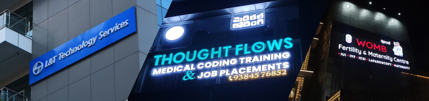
Choosing the right font for LED signages is crucial to grab attention and ensure readability. With various styles available, selecting a font that is clear from a distance can boost your brand visibility and customer engagement. The right typography can make your message shine even in low-light conditions.
Modern businesses are increasingly relying on LED signs to attract foot traffic and improve brand awareness. Fonts for LED signs must balance style and functionality, ensuring every character is easily legible. This guide explores top font choices and tips for LED signage design.
The font you choose affects visibility, readability, and the overall perception of your signage. Certain fonts enhance legibility on digital displays, while others may appear cluttered or hard to read from a distance. Using the right font can make your message stand out in busy environments, ensuring your LED signs communicate effectively.
Additionally, font choice impacts the emotional response of viewers. Bold, modern fonts can convey professionalism and innovation, while rounded or softer fonts may appear more friendly and approachable. Selecting fonts that align with your brand personality ensures consistency across all your marketing materials and strengthens brand recognition.
•Helvetica - Clean, modern, and highly readable, ideal for professional and retail displays.
•Futura - Geometric design ensures clarity and sharpness on LED panels.
•Arial - Classic sans-serif font, works well for long messages and smaller LED boards.
•Verdana - Designed for digital readability, perfect for outdoor LED signs.
•Impact - Bold and strong, draws attention from afar and highlights key messages.
•Roboto - Modern, friendly, and versatile for both indoor and outdoor LED displays.
•Open Sans - Simple yet stylish, enhances readability without overwhelming the design.
•Prioritize Legibility: Avoid overly decorative fonts that reduce readability.
•Consider Viewing Distance: Fonts must be readable from the intended distance, both day and night.
•Use Bold Styles: Bold fonts enhance visibility and grab attention quickly.
•Maintain Consistency: Limit font styles to 2–3 per display for professional appearance.
•Test Before Finalizing: Display your message on LED boards to ensure clarity under different lighting conditions.
In addition, consider the overall layout and spacing when choosing fonts. Proper letter spacing and line height can significantly improve readability, especially for longer messages. Combining clear fonts with optimal spacing ensures that your LED signage communicates the intended message efficiently without overwhelming the viewer.
• Using cursive or script fonts that blur at a distance.
• Overloading text with multiple font styles.
• Ignoring contrast between font color and LED background.
• Using extremely thin or condensed fonts that reduce legibility.
Selecting the right fonts for LED signages ensures your message is readable, attractive, and memorable. Clean, bold, and legible fonts make LED signs stand out in crowded spaces.
Investing time in choosing the correct typography can increase visibility, attract more customers, and enhance brand reputation. Make your LED signage message shine with the perfect font.
Visit our HBS Signages Kondapur for expert LED sign solutions and font recommendations.

Copyright © HBS Signage. All rights reserved.
Privacy-Policy | Terms & Conditions